Tobias Frere-Jones: A Man of Letters
Description
Type designer Tobias Frere-Jones disagrees with your 1st-grade teacher.
Featured Artists
Tobias Frere-Jones is a renowned designer of typefaces. His most widely used font, Gotham (released 2000) was used by the Obama presidential campaign in 2008.
Born in 1970 in New York and raised in Brooklyn, Frere-Jones comes from a family of writers: his father was an advertising copywriter, his maternal grandfather was a publisher, his great-grandfather was a bestselling author, his brother Sasha Frere-Jones is a music critic. He earned a BFA at Rhode Island School of Design in 1992 then worked as a type designer for the Font Bureau in Boston. His font Interstate (released 1995) was used by the Weather Channel, Southwest Airlines, Soundcloud, the U.S. Army, and other organizations. After working with designer Joseph Hoefler from 1999 to 2014, he founded his own firm in 2015.
Frere-Jones’s best-known typefaces include Whitney, designed as the institutional typeface of the Whitney Museum; Retina, designed for the Wall Street Journal; and Archer, designed for Martha Stewart Living. He teaches type design at Yale School of Art.
Transcript
The time between first waking and an encounter with a typeface is usually really short.
Tobias Frere-Jones: It’s probably the numbers on the clock that woke you up. And then from there until pretty much the time you go to bed you are surrounded by letters that someone somewhere has drawn.
Someone like Tobias Frere-Jones the designer responsible for some of the world’s most widely recognized typefaces including Interstate, Poynter and Gotham, among others. Frere-Jones was born into a family in the business of words; writers, editors and publishers. But from an early age the young Tobias fostered a secret love of images. And the impulse to paint and draw threatened all his assumptions about who he was destined to become. Then, as a teenager, he found what would turn out to be the perfect solution.
Frere-Jones: It was almost by accident that I discovered that there’s this tiny, tiny field called type design where people decide what the letters look like. And it occurred to me that this could be, this seemingly impossible, sort of, midpoint between being a painter and being a writer and I wouldn’t have to leave any of these behind. And that just settled it right there. I could still work with the language and I can draw stuff.
But years before a career in typography would come onto his radar, a young Frere-Jones was tuning into the nuances of type design in his daily life.
Frere-Jones: I think I was about 10, we made a visit to the UK to visit my grandmother and I remember noticing at her home in Kent, in being in London, there’s something about the words all around us that just tasted British somehow. My mother would bring home little jars of marmalade or little skeins of yarn and they would still look British. You would open up the cupboard and see that this jar came from down the road and this one came from London and this other one came from down the road and I just didn’t understand how that could work. It had nothing to do with the words themselves. I tried turning the labels around to see. So, I was looking at the back of them so I didn’t see what the actual names of any of these things were. And so, you just see just the overall impression of the letters and it was still there. And I realized later on that I was, you know, identifying typefaces.
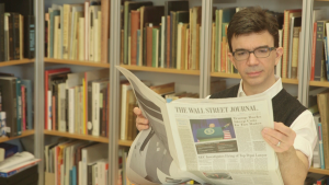
These British influences combined with his American upbringing to create Mallory, what Frere-Jones now refers to as his autobiographical font. But his real masterpiece of applied design was Retina, a very particular commission from the Wall Street Journal.
Frere-Jones: They needed a new design for the stock listings section of the paper and they needed something that would fit more text on the page because the page was shrinking, but also list more data in columns and in rows. And deal with the sort of unpredictability of ink on newsprint, just not an ideal medium. And also anticipate the readership of that part of the paper which is older than it is for the rest of the paper. Because the folks who are doing this for a living are getting their stock quotes online. The people who are getting their stock quotes out of the paper are most likely, for the larger part, retired and their eyesight is not as good as it used to be and this is five and a half point.
AJC: Close up when you really dig into this, it sort of looks Arthurian almost. Right? Because there’s almost like a Round Table type cross there. Which, close up, without my glasses on it disappears.
Frere-Jones: That’s the idea.
AJC: And it just makes, that intersection just works fine because it’s not cluttered.
Frere-Jones: Mm-hmm, that’s the idea.
AJC: Brilliant.
But for all his brilliance and 25 years of experience Tobias Frere-Jones still starts each letter set as it’s been done for hundreds of years, but it’s not how we, the reader, have been taught to approach our ABC‘s.
Frere-Jones: I think of the alphabet as camps of like-minded shapes. So, there are all the square, orthogonal shapes, the E, F, H, I, L, T. The round things like the O and the C and the S. Then the diagonal things like the V and the X and then there’s one letter that lives in the middle. This is why it can be so informative about, sort of the personality and the strategy of the design is the cap R, because you got a straight, you got a round, you got a diagonal.
AJC: Is that where you start?
Frere-Jones: It’ll be among the first ones that I’ll draw just to see what I’m in for, in this design. But I would often start with the most-simple representatives from these camps. So, the cap H, the cap O, and a cap D, for something that lives in between those two. And just in those first three letters there are global decisions to be made about how heavy things are, how wide they are, how weight moves from its heaviest to its lightest parts and what kind of difference that is. If there are serifs, what those are about. Very importantly, the space between one letter and the next. As much as we’re designing these black shapes, we’re also designing the white shapes inside the letters and in between the letters so that that has to be part of the foundation that we lay down.
AJC: Least favorite letter?
Frere-Jones: Z.
AJC: Interesting. What’s poor little zed done to you?
Frere-Jones: It’s never happy. Every time I think I’ve got it where it needs to be, I’ll run a proof, I’ll put this on paper, I say no, that’s too heavy, I got to go fix that. Now it’s too light, now it’s too wide. It comes down to just the direction of that diagonal through the middle of it. If, somehow, we could all agree that the Z would be flipped sideways, this would be a dream.
And Tobias Frere-Jones continues to live his own dream mastering a craft that combines his love of fine art and his love of letters, all of them from A to Y.